
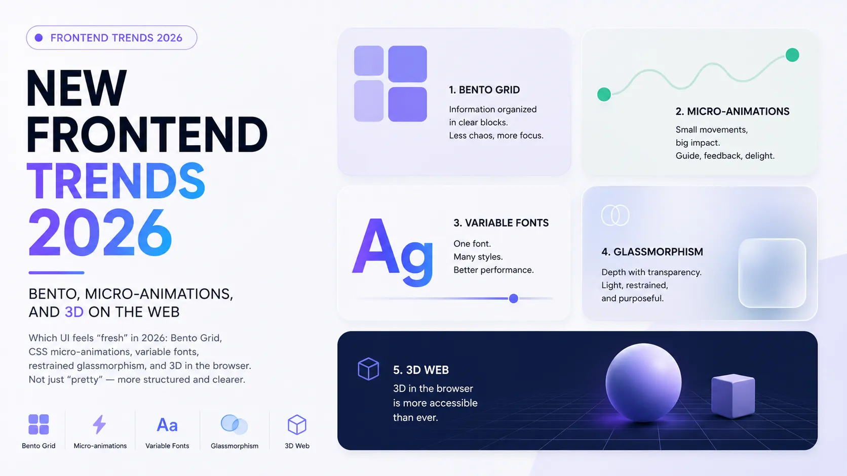
Frontend in 2026 looks different than it did three years ago. It's not just "in or out of fashion" that changed — what changed is which interface reads as modern and professional. And the key point: the strongest trends right now are not about decoration but about structure. They make an interface clearer, not just prettier.
In this article we'll unpack five patterns that became prominent in 2026 (and in places almost a standard), show what they're actually for, and where the line runs between "fresh" and "broke performance." It's useful both to a frontend developer and a UX/UI designer.
Five Frontend Patterns of 2026
Bento Grid
The name comes from Japanese bento boxes. It's a grid of "tiles" of varying sizes, each holding a separate block of content. Apple popularized the pattern at its keynotes, and from there it spread across SaaS landing pages and product sites.
Why it works: bento lets you show a lot of varied information without turning the page into chaos. Each tile is self-contained, and the grid keeps order. In 2026 the style added more pronounced corner rounding and subtle micro-interactions inside tiles. A detailed overview is in Line25's 2026 trends guide.
CSS Micro-Animations
Tiny, barely noticeable animations that react to user actions: a button that "springs" on hover, an icon that spins on click, a menu that slides in smoothly. The 2026 trend is to build them mostly with CSS animations rather than pulling in heavy JavaScript.
Why it works: a micro-animation is feedback. It signals that an action registered and makes the interface feel "alive." Moving animations to CSS means less JS, faster rendering, and a smoother result.
Variable Fonts
A single font file that contains the whole range of weights and widths instead of a dozen separate files. You control weight, width, and slant smoothly, right in CSS.
Why it works: fewer requests and less page weight (a performance win) plus more typographic flexibility — you can fine-tune the hierarchy without loading a pile of files.
Restrained Glassmorphism
The "frosted glass" effect is back — but different. Where in 2021 it was an aggressive full-screen device, in 2026 glassmorphism is used sparingly, as an accent, to create a sense of depth and layers rather than as the entire visual language.
Why it works: translucency with blur helps convey hierarchy — what's closer, what's further, what matters. The key word is restraint: the effect underlines the structure instead of fighting it.
3D in the Browser
3D has stopped being a "wow gimmick" and become a serious tool. Interactive objects that react to the cursor, scroll, or device tilt hold attention longer. The core technologies: Three.js, Spline, and React Three Fiber.
Why it works: depth and interactivity make a product stand out. But here's the main caveat — 3D and WebGL easily "eat" the performance budget. Use it selectively and always test on low-end devices.
A Trend Isn't About "Pretty" — It's About Structure
The temptation to chase trends for looks leads to a dead end. Notice: all five patterns above actually solve a problem of structure and clarity. Bento organizes content, micro-animations give feedback, variable fonts build hierarchy, glassmorphism conveys depth, 3D focuses attention.
So the rule is simple: apply a trend when it makes the interface clearer, not just trendier. A trend for its own sake ages in a season; a trend that solves a problem sticks.
FAQ
Do I have to chase every trend?
No. Choose what solves your product's problem. One well-placed bento block beats five effects added "because it's fashionable." A trend is a tool, not an obligation.
Won't 3D hurt performance?
It can, if used carelessly. 3D and WebGL are heavy on low-end devices. Use it selectively, provide a fallback, and always check speed metrics on real phones.
Where do I start as a beginner?
With CSS micro-animations and a basic bento layout — these are the cheapest trends in complexity with the biggest visual payoff. Leave 3D for later, once you're confident with the fundamentals.
What to Show in Your Portfolio
Trends are a great reason to refresh your portfolio. But show the reasoning, not "effect for effect's sake": why you chose bento for this page, how a micro-animation improved clarity, how you preserved performance with 3D. That's the thinking the market values. How to build a strong case is in the guide How to Make a Portfolio, and the specifics for frontend are in the article on the frontend developer portfolio. If the structural side of UI interests you, read about the design system in Figma.
Add the relevant skills and tools to your profile, tag your project technologies, and see how other specialists present their work.
Ready to act?
- Create your own portfolio: https://searchtalent.dev/en/projects/new
- Skill and technology directory: https://searchtalent.dev/en/talents/skill
- Browse other specialists' projects: https://searchtalent.dev/en/projects
- More articles: https://searchtalent.dev/en/articles