
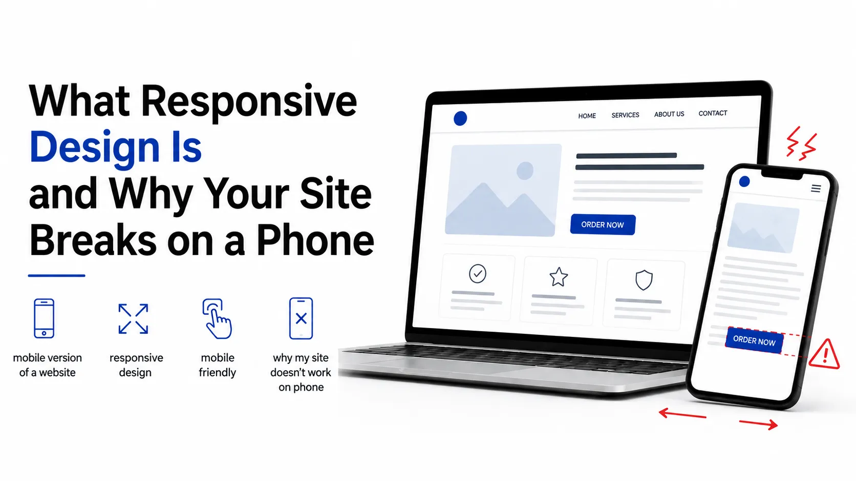
A situation familiar to almost every site owner: everything looks fine on a computer, then you open the site on your phone and the text is tiny, the "Order" button is half off-screen, and the page slides sideways. Meanwhile the specialist says it is all done.
Formally they may be right: the site exists and opens. The problem is that most of your visitors are looking at it on a phone — and for them the site does not work. Not "works worse than on desktop" — does not work: if the button cannot be tapped, there is no order.
This article explains in plain language what responsiveness is, where the typical breakages come from, how to test your own site, and what to require so the conversation never arises.
What Responsiveness Is
Responsive layout means the site rearranges its structure to fit the screen: on a wide monitor blocks sit in three columns, on a phone they stack into one, the menu collapses into a button, fonts and spacing change.
The key word is structure, not scale. Bad imitation of responsiveness is when the page is simply shrunk to fit: technically it fits, but the text is unreadable and tapping requires aiming.
What to distinguish:
- A responsive site — one site that changes appearance by screen. Today's standard.
- A separate mobile version — a second site on a separate address. An outdated approach: two versions must be maintained separately and always drift apart.
- Plain scaling — not responsiveness at all, just the appearance of it.
Responsiveness is not about "fitting" but about the site being usable on a phone: readable without zoom and tappable with a finger without aiming.
Symptoms and What Causes Them
Every typical complaint has a specific technical cause.
The page slides sideways (horizontal scroll). Almost always some element is wider than the screen: a table, an image, a long word or link, a block with a fixed pixel width. One such element stretches the whole page.
Text is tiny and needs zooming. Font sizes were set for desktop and do not change on small screens, or the page was never told to adapt to the device width.
Buttons do not respond on the first tap. Elements were sized for a mouse cursor rather than a finger. A finger needs a noticeably larger target, and adjacent links must not sit flush against each other.
Images are stretched or cropped. The image was inserted at a fixed size, so on another screen it either overflows or distorts.
The menu is unreachable. A horizontal ten-item menu physically does not fit a phone, and no mobile variant was designed.
The form cannot be filled in. Fields are narrow, labels overlap, the keyboard covers half the screen and the page will not scroll to the field in use.
Blocks overlap each other. The layout assumes a specific width, and outside it elements collide.
The site takes forever on mobile data. Not "breaking" as such, but the outcome is the same: the person leaves before it loads. A separate section below.
Why It Happens
The causes are almost always in the process rather than in one person's competence.
- The design was only drawn for desktop. Then the developer has to invent the mobile appearance themselves, and the result is arbitrary.
- Fixed pixel sizes instead of flexible ones. A block exactly 1200 pixels wide on a 390-pixel screen behaves exactly as you are seeing.
- It was never tested on real devices. A narrowed browser window is not a phone: different pixel density, different fonts, different keyboard behavior.
- Content was added later. The layout was fine until an eight-column table or a long unbroken name was loaded into it.
- Responsiveness was not in the spec. The most common source of disputes: the client assumed it was obvious, the specialist treated it as separate work. How to avoid that is in How to write a brief.
Breakpoints in Plain Language
A breakpoint is a screen width at which the layout rearranges. Roughly: up to a certain width blocks sit in three columns, below it in two, below that in one.
What matters to a client:
- There are usually several breakpoints — not "desktop and mobile" but multiple states, including tablets and large phones.
- Each breakpoint is separate design and build work. That is why responsiveness affects price: it is not one checkbox but several versions of the same page. The cost structure is covered in How much does a website cost.
- Test between breakpoints too: things most often break at the in-between widths.
Mobile Is Not a Shrunken Desktop
The core mental mistake. On a phone, more than the size changes:
- A finger instead of a cursor. No hover, no precise aiming, plenty of accidental taps.
- A vertical flow. Everything stacks into one column, so block order becomes critical: what sat in a sidebar on desktop ends up above or below on mobile.
- A different user situation. People are moving, in a hurry, often without sound. Long text and complex forms perform worse.
- Less is visible at once. The essentials belong on the first screen: what this is, who it is for, what to tap.
- The keyboard eats half the screen — forms must account for that.
- Hover does not exist. Anything that appears "on hover" is either unavailable or unpredictable on a phone.
Hence the correct working order: mobile layout first, desktop second. That way the essentials are decided up front, and on a wide screen you add space rather than throw blocks away.
Do I need a separate mobile version of my site?
In most cases, no. A separate mobile site on a different address is an outdated approach: two versions must be maintained in parallel, they gradually diverge in content, and search engines receive duplicates that have to be linked correctly.
The modern solution is one responsive site. A separate version only makes sense in narrow cases — when the mobile scenario is fundamentally different from desktop (a full account area versus simple browsing, for instance) — and even then the conversation is usually about an app rather than a second site.
Speed Is Part of Responsiveness
A site can be perfectly built and still fail on mobile simply because it does not load in time.
- Images are the main cause. A multi-megabyte camera photo takes noticeably long on a phone. Images must be compressed and served at the size the screen actually needs.
- Mobile networks are uneven. Your site gets opened on transport, in a lift, out of town — not on office Wi-Fi.
- Every extra second costs visitors. People do not wait; they go back to the results page.
- Test on a mobile network, not only on home Wi-Fi. The simplest way to see the real picture.
Broader context on modern performance expectations is in Modern web development.
Test Your Site in 10 Minutes
No tools or special knowledge required:
- Open the site on a real phone, not a narrowed browser window.
- Try dragging the page sideways. If it moves, something is wider than the screen.
- Read the text without zooming. If you had to zoom, the font is too small.
- Tap the main button with a finger, not a fingernail and without aiming.
- Fill in a form completely and submit it. Half the problems surface here.
- Open the menu and visit two or three sections.
- Rotate the phone horizontally — the layout must not fall apart.
- Check on a second phone with a different screen size, ideally an older one.
- Turn off Wi-Fi and open the site on mobile data.
- Walk the full path to the goal: from the homepage to an enquiry or a completed order.
If any step felt awkward to you, clients will feel it too — they just will not tell you, they will close the tab.
What to Require From a Specialist
- State responsiveness explicitly in the spec. Not "the site should be convenient" but "mobile, tablet and desktop layouts and build."
- Require mobile mockups at the design stage, not after the build. Otherwise the mobile appearance gets improvised.
- Agree the list of devices the result is checked on.
- Verify it yourself before paying, using the checklist above — part of accepting delivered work.
- Clarify what happens with new content. A long product name or a wide table must not break the page.
- Do not treat responsiveness as a free bonus. It is real work included in the price, and it should be named in the proposal.
Common Mistakes
- Testing by narrowing the browser window. Approximate, and it hides tap and keyboard problems.
- Only checking on your own phone. Your screen is not the only one that exists.
- Designing for desktop only. The mobile result ends up arbitrary.
- Putting everything from desktop onto mobile. Priorities on a small screen are different.
- Ignoring image weight. The cheapest and most common cause of a slow site.
- Forgetting forms. The most frequent place mobile leads are lost.
- Relying on hover. It does not exist on a phone.
- Not rechecking after adding content. Layouts break precisely when real text and photos arrive.
Key Takeaways
- Responsiveness means rearranging structure for the screen, not shrinking the page.
- Horizontal scrolling almost always means one element wider than the screen.
- Mobile is not a shrunken desktop: different block order, finger instead of cursor, no hover.
- The correct order of work is mobile layout first, desktop second.
- Speed is part of responsiveness: heavy images kill a site on mobile data.
- Test on real devices and on a mobile network, not in a narrowed browser window.
- Responsiveness must be explicit in the spec, or it becomes a dispute at delivery.
- A separate mobile version is almost always unnecessary today.
FAQ
Why does my site look fine on a computer and break on a phone?
Because the layout assumes a wide screen: sizes are fixed, blocks do not rearrange, and the menu and forms have no mobile variant. The most common specific cause of horizontal scrolling is a single element wider than the screen — an image, a table, a fixed-width block, or a long word or link that does not wrap.
What is responsive design in plain language?
It is when a site changes its structure to fit the screen: columns stack into one, the menu collapses into a button, fonts and spacing adapt. The key is rearranging structure rather than scaling the page: if the page was merely shrunk to fit, that is an imitation of responsiveness, not the real thing.
Do I need a separate mobile version of my site?
Usually not. The modern standard is one responsive site that works on all screens. A separate mobile version on another address means two sites maintained in parallel that drift apart in content over time. The exception is when the mobile scenario is fundamentally different — and even then an app is the more common answer.
How do I check whether my site is responsive?
Open it on a real phone and walk the whole path to the goal: try dragging the page sideways, read text without zooming, tap the main button with a finger, fill in and submit a form, open the menu, rotate the phone. Separately, test on mobile data with Wi-Fi off and, if possible, on a second phone with a different screen.
What to Do Next
Run the ten checks from your own phone — ten minutes that turn a vague "something's off" into a concrete list of problems. Every item on that list is already a well-formed task for a specialist.
If the site is still being planned, put responsiveness in the spec and require mobile mockups at the design stage: far cheaper than reworking the build later. Find a specialist in the talent catalog, and the basic terms that will come up in that conversation are collected in Domain, hosting, CMS, API and Git explained.
Ready to act?
- Find a specialist in the catalog: https://searchtalent.dev/en/talents
- Browse specialists' projects: https://searchtalent.dev/en/projects
- Skills and technologies catalog: https://searchtalent.dev/en/talents/skill
- More articles: https://searchtalent.dev/en/articles