
A pretty mockup is no longer proof of skill. Today a UX/UI designer is expected to deliver not a set of nice individual screens, but a system those screens are assembled from — consistently, quickly, and in a way that lets the product scale. That system lives in Figma and is called a design system.
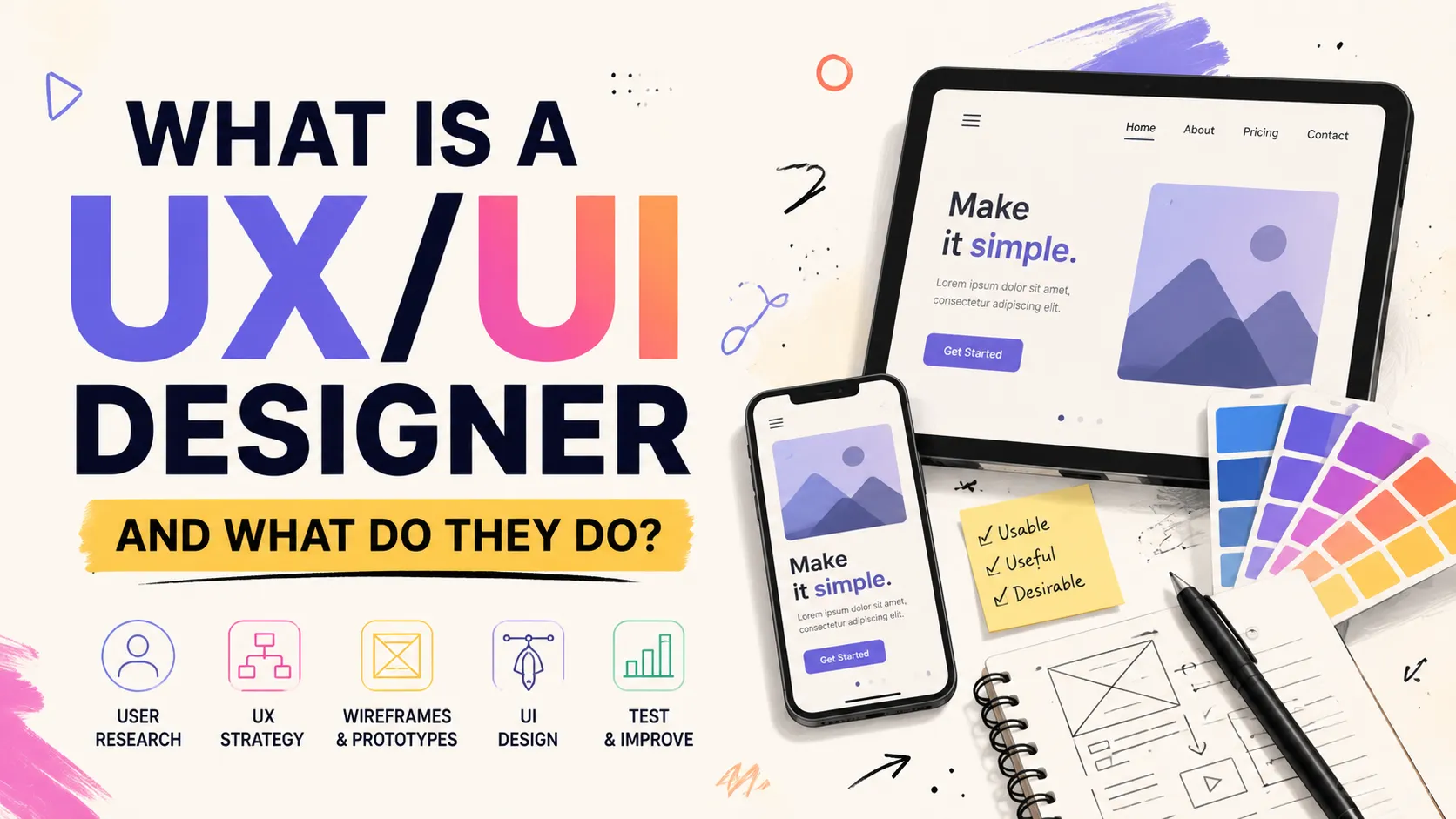
In this article we will unpack, in plain words, what a design system is, why a UX/UI designer needs one, where to actually start in Figma, and why it's not "theory for show" but a daily working tool. If you are still getting to know the profession, it helps to first read who a UX/UI designer is and what they do — this article is the next, practical step.
What a Design System Is, in Plain Words
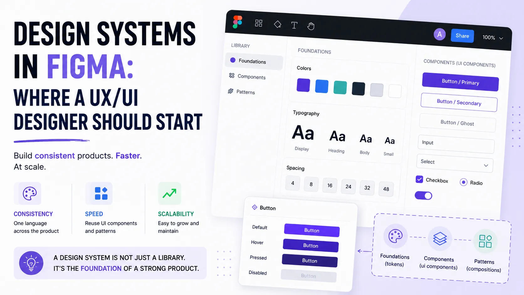
A design system is not a single mockup but a set of reusable building blocks and rules the whole interface is built from: colors, typography, components (buttons, inputs, cards), and guidelines for how to use them. Figma itself describes a design system as a set of components, styles, and assets that keep a product consistent across teams and products.
A simple analogy: a mockup is a finished dish, while a design system is a kitchen with ingredients and recipes. With a kitchen you can cook any dish fast and in the same style. Without one, you start from scratch every time.
Why a UX/UI Designer Needs One
For a UI/UX designer, a design system solves several pains at once:
- Consistency. Identical buttons, spacing, and colors across all screens — the interface reads as one whole, not a patchwork quilt.
- Speed. A new screen is assembled from ready components in minutes instead of being redrawn each time.
- Fewer decisions. You don't decide yet again which shade of gray to use — the decision is already made and fixed.
- Easier handoff to developers. Components and tokens map to code almost one-to-one, so there's less friction at handoff.
Where to Start in Figma
The main beginner mistake is trying to build a hundred-element "monster" right away. The right path is to start small and grow. Here's a base order:
- Colors. Create styles or variables for your palette. Good practice is two levels:
- primitives — the raw palette (e.g.
blue-500,gray-100); - semantic — roles that reference the primitives (
text-primary,surface,border), with Light/Dark modes.
- primitives — the raw palette (e.g.
- Typography. Define text styles with a clear hierarchy:
- headings (H1–H3), body text, captions;
- identical sizes, line heights, and weights across the product.
- Grid and spacing. Pick a step (usually 8px) and stick to it in padding and gaps — that's what makes a layout look "tidy" almost automatically.
- Components. Build base ui components — buttons, inputs, cards:
- use variants for states (default, hover, disabled);
- turn on auto layout so components stretch to fit content.
- Library. Publish everything to a team library so components are a drag-and-drop away in all team files.
You don't have to build this from scratch. Figma Community has ready base design systems — an official starter UI kit from Figma that shows best practices and saves weeks. This path is also walked step by step in the Figma "Build your design system" lesson, and the finer points of components and libraries are in Figma's best-practices guide.
How a Design System Differs from Just a Pretty Mockup
This is the key difference worth understanding once and for all:
- A mockup shows how one specific screen looks. It's the final picture.
- A design system defines what any screen is assembled from. It's the single source of truth.
Change a button color in the design system and it updates across all hundred screens automatically. In "just a mockup" you'd fix each one by hand. That's exactly why a design system scales and a pretty mockup does not.
Why It Matters for the Team and for Scaling
Solo, you can work without a system. But the moment a team appears or the product grows, a design system becomes critical:
- A single source of truth — every designer and developer pulls elements from one place, so the product doesn't drift apart.
- Scaling to themes and brands — via variable modes, one system supports light/dark themes or several brands without duplication.
- Onboarding new people — a newcomer quickly grasps the rules, because they're written down, not "in the team lead's head."
It's no accident that Figma positions itself as a shared environment where design, code, and AI work together: a design system is exactly that bridge between design and development.
Common Beginner Mistakes
- Building too large a system at once instead of growing gradually.
- Having no naming conventions — then you can't find the style you need.
- Ignoring auto layout — components don't stretch to content and break.
- Confusing a mockup with a system — making it "pretty once" with no reusability.
FAQ
How many components do I need at the start?
The minimum: a color palette, a few text styles, and 3–5 base components (button, input, card). That's enough to assemble your first screens. Add the rest when you actually need it.
Do I need a design system for a small project?
Even for a single landing page, base color and typography styles save time and prevent inconsistency. A full system with a library makes sense once the project grows or a team works on it.
Does it replace design skills?
No. A design system is a tool, not a replacement for taste and UX understanding. It removes the routine so you spend time on hard decisions instead of copying buttons.
What to Show in Your Portfolio
A design system is a strong case for a UX/UI designer's portfolio. Show not only the final screens but the system behind them: how tokens, components, and states are organized. It proves you think systematically rather than just "drawing nicely." How to build such a case is covered in the guide How to Make a Portfolio, and examples for inspiration are in the article on the designer portfolio.
Add the relevant skills and tools to your profile, tag your project technologies, and see how other specialists present their work.
Ready to act?
- Create your own portfolio: https://searchtalent.dev/en/projects/new
- Skill and technology directory: https://searchtalent.dev/en/talents/skill
- Browse other specialists' projects: https://searchtalent.dev/en/projects
- More articles: https://searchtalent.dev/en/articles