
A strong UI UX portfolio convinces people not with pretty screens but with the thinking behind them: how you understood the problem, what you decided, and why. A recruiter or client looks at your work for a minute or two, and in that time they should see not a gallery of mockups but a designer who thinks in terms of product. Below we break down how to structure a UI UX portfolio, how to write case studies, how many you need, and where to find inspiration — no filler, just substance.
Why Case Studies Matter More Than Pretty Screens
A polished interface is table stakes, not an argument. Plenty of people can produce a neat dashboard or a clean screen of mobile app design. What sets you apart is what a screenshot can't show: your grasp of the problem, your research, your trade-offs, and your impact on metrics.
A case study shows why you made a decision; an image shows only what came out. That's why case studies do the heavy lifting in any portfolio: they turn a set of final mockups into proof that you can solve product problems rather than just color in frames. If a viewer walks away understanding how you think, the portfolio worked. A great design case study leaves no doubt about your reasoning.
Anatomy of a UX Case Study
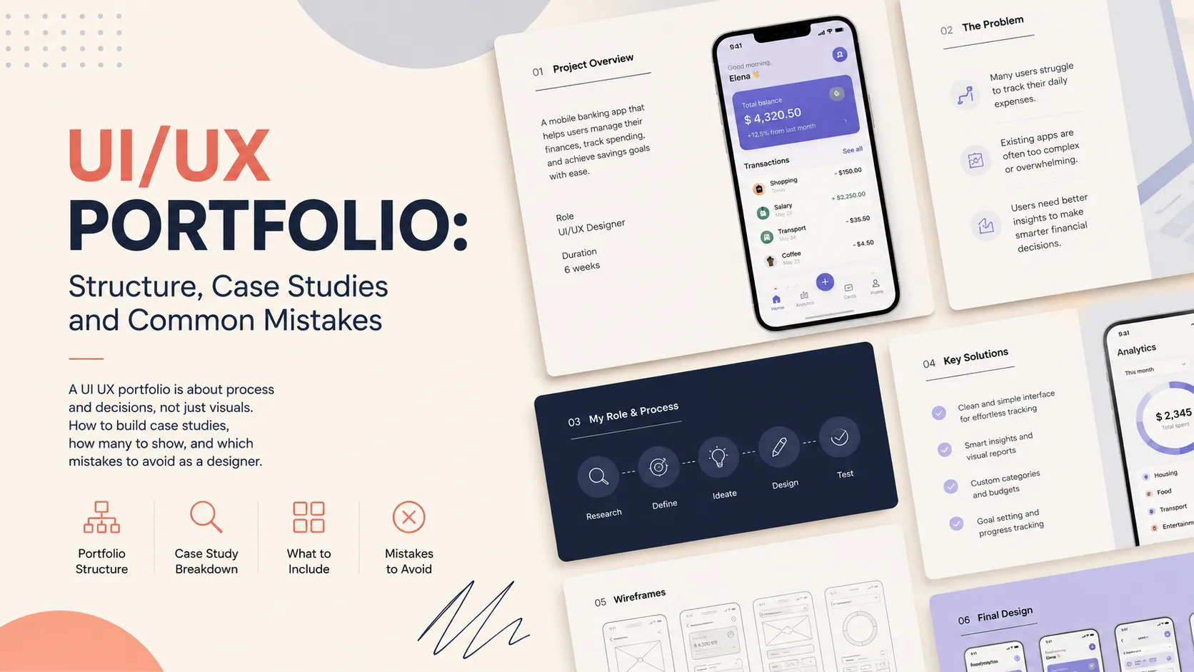
A good case study reads like a short, logical story. Stick to five blocks:
- Problem / context. What product, who the users are, the business goal, and the constraints (deadline, legacy, platform). This sets scale and shows you see beyond a single screen.
- Research. What you learned before designing: interviews, competitor analysis, an audit of the current flow, analytics. Even light research separates a designer from a decorator.
- Process. How you moved from problem to solution: hypotheses, sketches, wireframes, iterations. This is where thinking shows.
- Decisions and trade-offs. Why this option, which alternatives you rejected, and why. Show the forks in the road, not just the final frame.
- Outcome / impact. Metrics or a qualitative effect: conversion, task time, NPS, stakeholder feedback. If the project isn't shipped yet, describe the expected effect and how you'd measure it.
The "research → process → decisions" blocks are what separate a real UX portfolio from a plain gallery. Without them, a design case study becomes a pretty but mute slide.
How Many Case Studies You Need
Depth beats volume. Two to four solid case studies are enough to show your level; a dozen shallow ones only dilute attention and make people wonder whether real work sits behind them.
One project explained in detail, with research and metrics, beats five screens of "made it look nice." Lead with your strongest case — it decides whether anyone scrolls further. If you're early in your career, one strong concept case plus one real project work better than padding the page.
How to Show Process, Not Just the Final Screen
A final mockup with no process leaves the viewer asking, "but how did you get there?" Show the path:
- Wireframes and sketches — even rough ones. They prove the solution matured rather than appeared by accident.
- User flows and diagrams — how the user moves through the product and where the bottlenecks were.
- Iterations — place an early version next to the final one and explain what changed. "Version 1 failed the navigation test, so we…" is the most convincing line in any portfolio.
You don't need every step — pick 2–3 moments where your decision actually changed the outcome. This works for web design as much as for complex dashboard interfaces.
UI vs UX: Where to Put the Emphasis
Designers differ, and your portfolio should reflect that honestly. A UI focus is the visual system: typography, grid, components, states, micro-interactions. A UX focus is structure, flows, research, and testing.
If you're a UI designer, your UI portfolio should shine visually but still explain decisions: why this grid, why these button states. If you're a UX designer, your UX portfolio shows logic and data even when someone else produced the final visuals — in which case say so honestly. Most strong cases combine both: a considered flow and a clean interface. The key is not to pose as UX where the work was only cosmetic.
Showing Metrics and Impact (Even on Concept Work)
Metrics are the language people will use to talk product with you. Real numbers are strongest: "checkout time dropped 32%," "form errors halved," "retention rose after the onboarding redesign."
If the project is a study or concept, metrics still belong — just labeled honestly as expected or hypothetical:
- state a hypothesis: "we expect cutting the flow to three steps to lift conversion";
- describe how you'd measure it (A/B test, analytics, usability sessions);
- show the result of a mini-test if you ran one, even with five people.
This demonstrates product thinking more powerfully than any pretty screen, and it sets you apart from people who show only static images. A design case study with a measurement plan reads as professional, shipped or not.
Where to Find UI/UX Inspiration
Study how the best present their cases, but dissect the structure rather than copy the visuals. Useful external resources (browse at the section level; don't lift others' work verbatim):
- Mobbin — real patterns from production apps, great for mobile app design.
- Dribbble — UI, micro-interactions, visual trends.
- Behance — full case studies with process write-ups.
- Figma Community — files, design systems, case templates.
- Awwwards — top-tier web design and digital products.
Aim for work slightly above your level — it sets the bar to reach for.
Common UI/UX Portfolio Mistakes- Pretty-only, no problem. Beautiful screens without context read like wallpaper, not design work.
- No problem framing. If it's unclear what you solved, no one can judge the solution.
- Unclear role. On team projects, state honestly what you did and what others did.
- Hidden process. Final screens with no wireframes or iterations strip the case of evidence.
- Zero metrics or impact. Even qualitative feedback beats silence.
- Everything dumped in. Weak work drags strong work down — cut ruthlessly.
FAQ
What should a UI UX portfolio include if I have no commercial experience? Build a concept case: a redesign of a product you know or an invented brief. Run the full cycle — problem → research → process → decisions → expected outcome — and write it up as seriously as a real project. Quality of thinking shows even in non-commercial work.
How many case studies should a UX portfolio show? Two to four deep case studies beat a dozen shallow ones. Lead with your best. It's better to add one new solid project than to keep several weak ones for the sake of volume.
How does a UI portfolio differ from a UX portfolio? A UI portfolio leans on the visual system, components, and polish, while a UX portfolio leans on flows, research, and the logic of decisions. In practice the line blurs — a strong design case study explains both why it looks the way it does and why it works.
Ready to act?- Publish your UI/UX case: https://searchtalent.dev/en/projects/new
- Browse design projects: https://searchtalent.dev/en/projects
- Find designers: https://searchtalent.dev/en/talents