
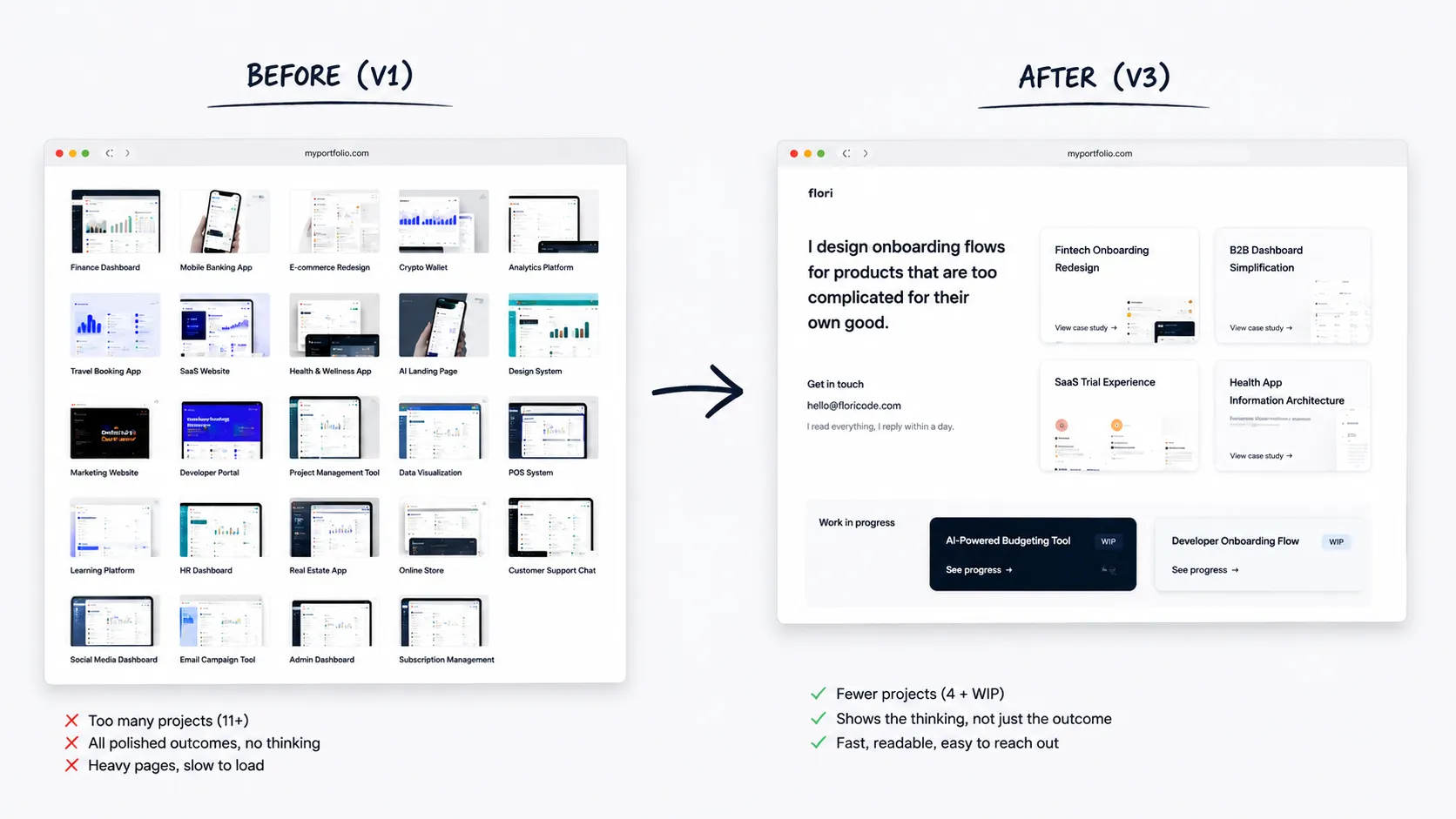
The first version of my portfolio had eleven projects on it. I was proud of that number. Eleven felt like proof that I'd been busy, that I was serious, that nobody could look at the grid and think this person doesn't work hard.
Nobody replied to it. Not "no" — just nothing.
What I thought the problem was (and wasn't)
I assumed the work wasn't good enough. So I spent two months polishing. Re-exporting screenshots at 2x, redoing the case study layouts, adding those little device mockups that make everything look like an Apple keynote. 🙂
Version two. Twelve projects now. Still nothing.
The honest turning point came from a friend who does hiring. I sent her the link expecting notes on the visuals. She wrote back one line:
"I genuinely can't tell what you'd be like to work with. Every project looks finished and perfect, which means I can't see you thinking."
That stung, because it was right.
The third version: fewer projects, more thinking
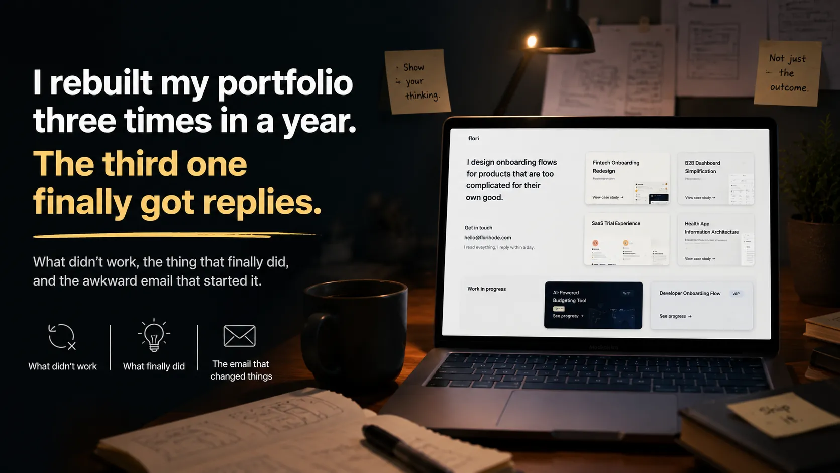
I cut it down to four projects. Then I rewrote each one around a single idea — not "here's what I made" but "here's the decision I was scared to make."
For each case study I forced myself to answer three things in plain language:
- What was the actual constraint? (budget, a stubborn stakeholder, a two-day deadline — the real one, not the polished one)
- What did I try first that failed?
- Why did the final call make sense even though it wasn't the prettiest option?
That third question did most of the work. Designers love showing the polished frame. Almost nobody shows the ugly intermediate one next to it and says I chose the left one and here's why. When you do, people suddenly trust you, because you've shown them how you think under pressure.
The boring technical bits that mattered more than I expected
A few things I'd dismissed as trivial turned out to move the needle:
- Load time. My old portfolio shipped 14 MB of uncompressed PNGs on the landing view. People left before the grid even rendered. Converting to compressed images cut it to under 2 MB and the bounce rate visibly dropped.
- One readable paragraph above the fold. Not a tagline. An actual sentence a human would say out loud: "I design onboarding flows for products that are too complicated for their own good."
- A real contact line. Not a form. Just an email and the sentence "I read everything, I reply within a day." Lowering the stakes of contacting me mattered more than any animation.
I also stopped hiding the unfinished work. I added a short section literally labelled Work in progress with two half-built things. Counterintuitively, that's the section people mention most.
The email that changed things
The reply that broke the silence wasn't from a recruiter. It was from someone who'd read the Work in progress section and wanted to talk about the half-built thing, not the polished four. We ended up collaborating for three months.
If I had to compress the whole year into one takeaway:
A portfolio isn't a trophy case. It's a conversation starter. Build it so someone has an obvious reason to hit reply.
I still don't think version three is done. But it's the first one that felt like me instead of like a performance of me. That turned out to be the whole point.